
Edward Gordon Craig- Scenic Artist, Actor and Designer
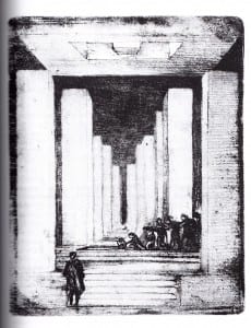
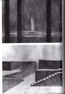
The above designs are by the famous theatre practitioner Edward Gordon Craig, who has been extremely influential in terms of shaping the design styles and approaches of succeeding set design creations. In my opinion, the main and most impressive features of Gordon Craig’s work would be the confidence in his use of vertical lines and columns and layering of these shapes to create a sense of depth to an overall stage image. Furthermore, his use of steps and levels runs in complimentary order to the height of the stage, which is an adaptable use of set pieces.
I have taken the role of imparting my pre-existing knowledge of successful set design concepts and painting techniques, where the ideas of elevated, striking sets, such as those devised by Gordon Craig, could be beneficial in terms of how we could create the overall aesthetic ‘look’ of our production. Concentrating on a gothic twist, however, I need to find a way to adapt these influences to suit our stage space and production values, and bring in the director’s and production manager’s ideas into one cohesive, consistent and practical outcome.
—————————————————————————————————————–

- Creative Mood Board
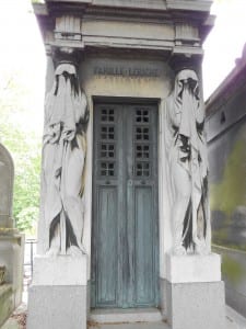
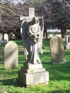
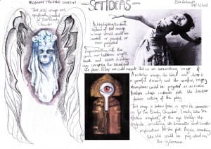
- I created this mini project as a means of developing a consistent set of gothic/ and or fairtytale images which may be useful for the design of the set. The innocent maiden, for example, as an emblem of a forgotten or once happy past, could be a powerful recurring image, as too could the concept of imagining a serene angel statue become manipulated by death and destruction, coming to life, or changing someway throughout the production to shock or impress the audience as a visual spectacle.
- Linking to the director’s suggestion that we focus on The Bloody Chamber by Angela Carter, I have been experimenting with symbolic or iconic images which we could display to remind the audience of a particular event which triggers the action, such as the brutal murders of the dead wives which occurs in the story.

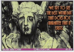
- Angel Concept/ Poster Design
- With this idea, I was trying to focus on how I could create an overall look for the show, taking inspiration from the popular video game series BioShock, which has a distinctive dark and sinsiter art deco style, twisting the conventions of cheerful posters and adverts, and creating, looming and mysterious alernatives. In this regard, I created a ‘poster’ image, with a mysterious slogan which would fit as a concept of what the production could try to project. I find these types of activities useful, as a way of developing a clearer concept for myself as a designer.

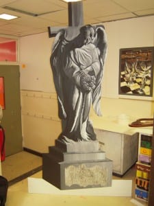
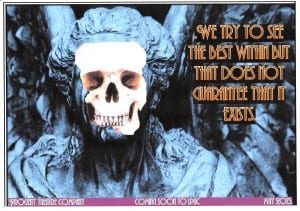
- Angel Concept with Skull
- Here, I manipulated the angel image to try and emphasise the idea of one image triggering two different interpretations for an audience. This is also consistent with the director’s specifications that we create the concept of liminal spaces; a collision of two worlds.
(Please click on the images to see larger versions)
Word Count: 490.
Works Cited:
Carter, Angela (1995) The Bloody Chamber, London: Vintage Press.
Russell, John Brown (2001) The Oxford Illustrated History of Theatre, Oxford University Press.
Zarilli, Phillip B, Bruce McConachie, Gary Jay Williams, Carol Fisher Sorgenfrei (2010) Theatre Histories: An Introduction, London: Routledge.
2K Games (2002-2012) BioShock.
