Posters
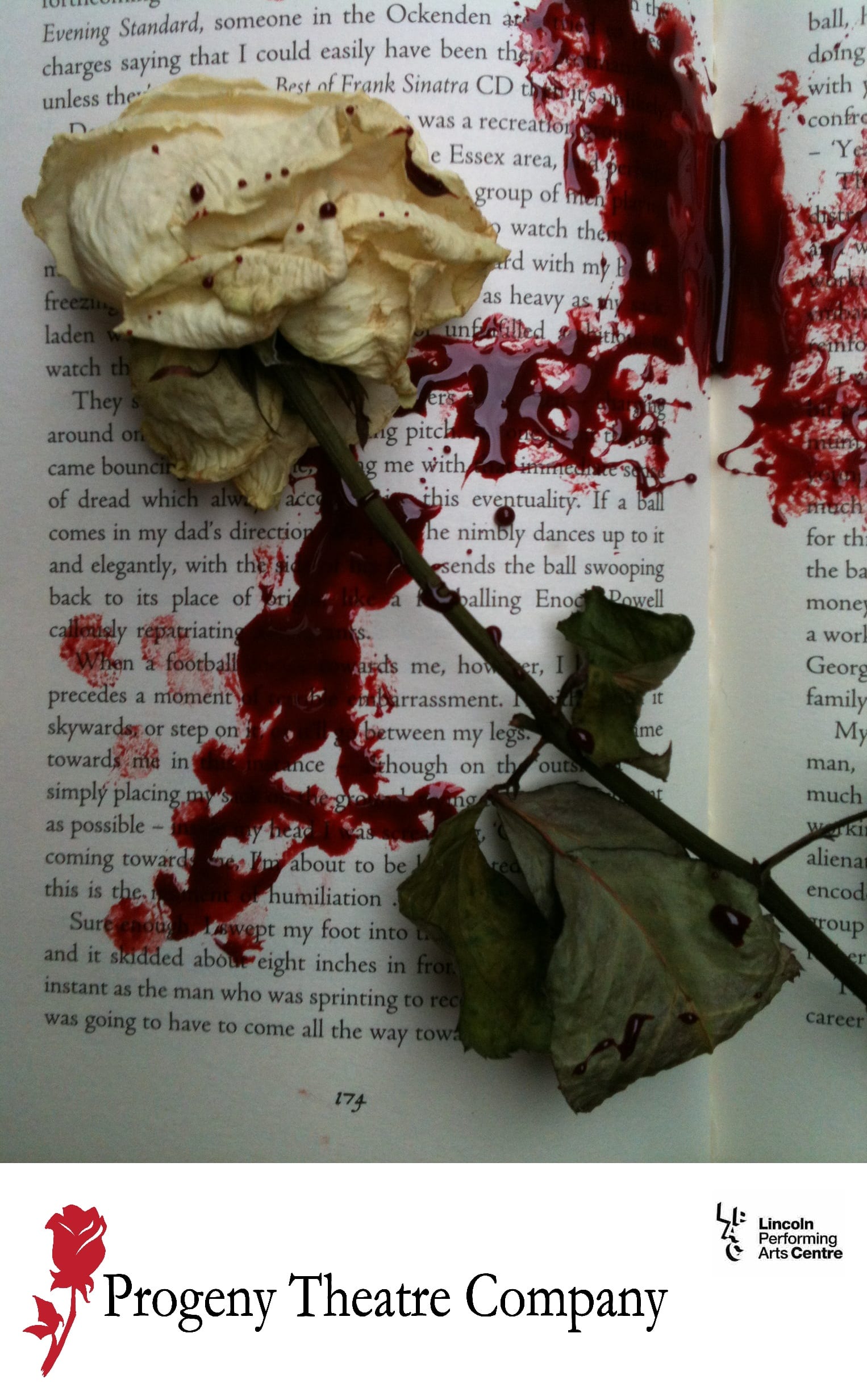
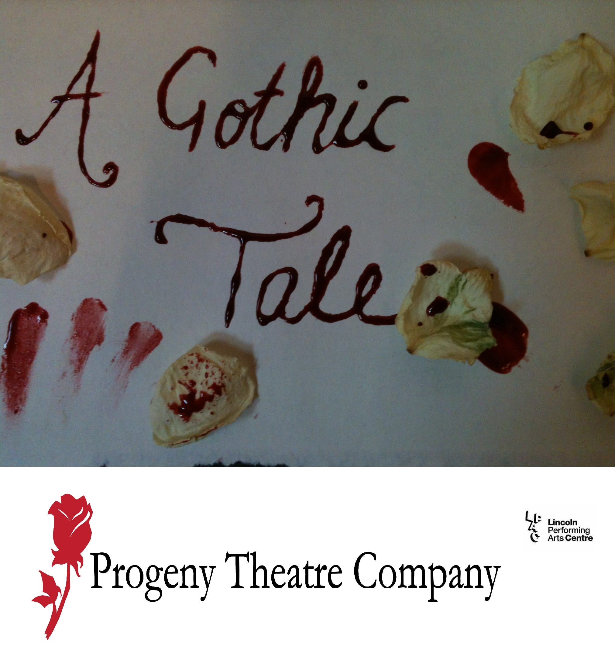
After revising the first set of posters that we created, we decided to create new ones as we were not fully satisfied with them- due to things such as the poor lighting – shown below:
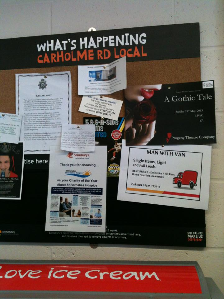
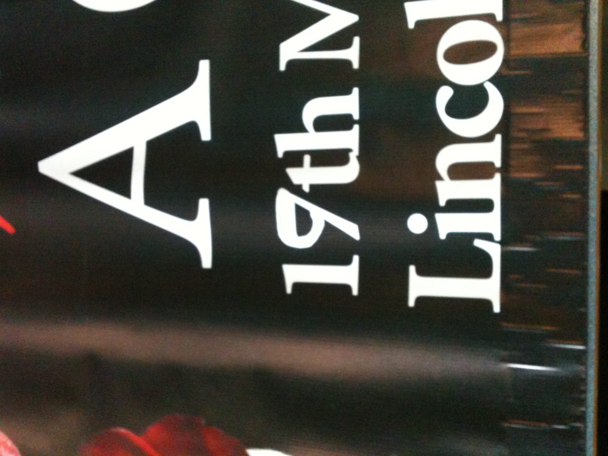
This time we decided to use a royalty free image as we found one which fit our piece perfectly. The image was of a woman holding a rose (one of our motifs). The only part of the woman which was visible is her hand and her lips, on a black background. We like the simplicity of this photo as it is eye catching without giving much about our performance away. So we extended the black background to the right of the image so that we could include the necessary information. We wanted to make our poster noticeable so that it was clearly visible even amongst other posters. The darkness of our poster makes it stand out from others.

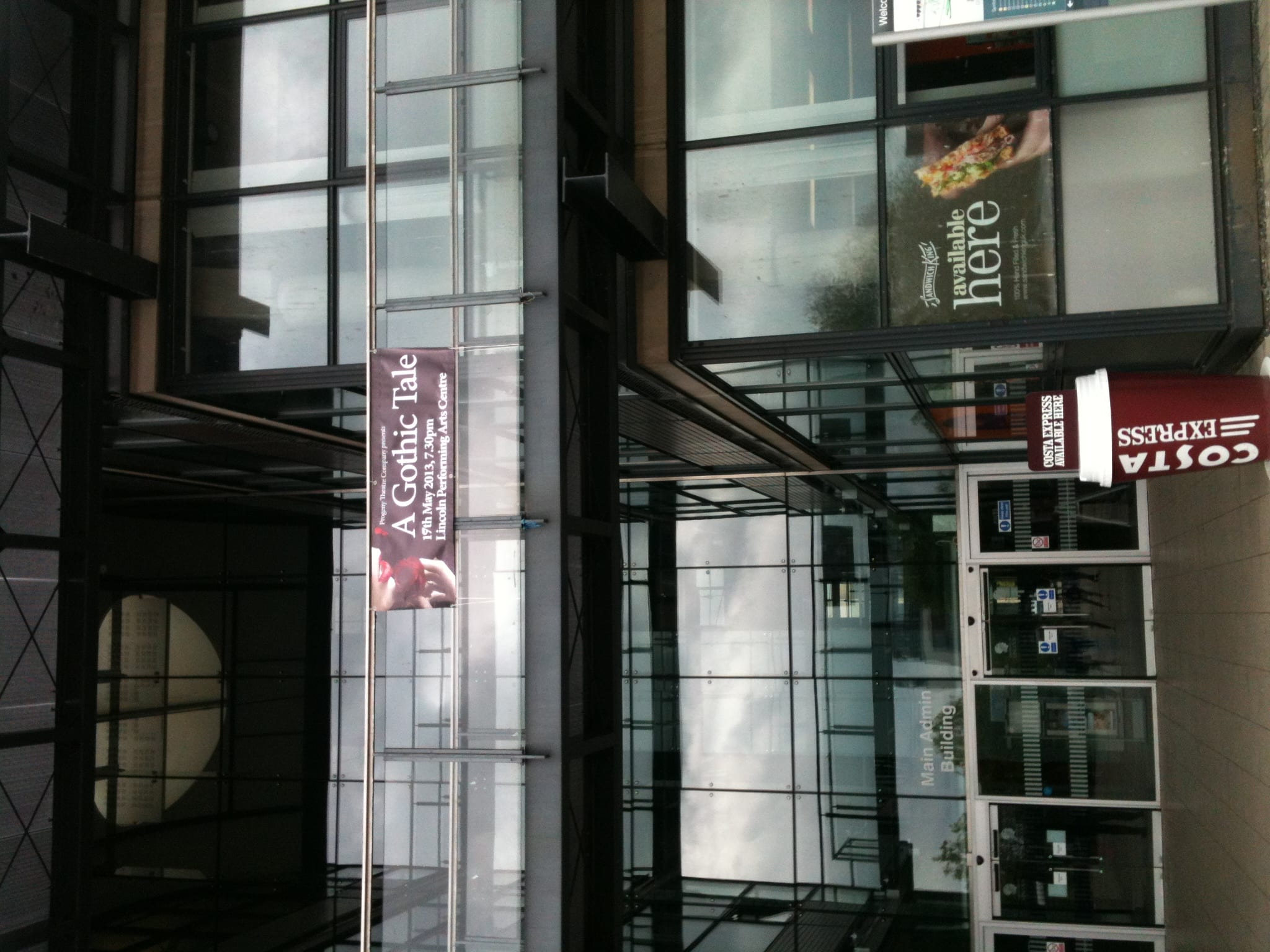
Once our posters had been printed and delivered, after getting them stamped by the university, we began putting them around the university campus. Firstly we put them around Lincoln Performing Arts Centre (LPAC) and then we put them in the university library so that all students would see them. We then put them in the Media building, the students union, the main building, the Shed (public house) as well as in other areas around the campus. However, as our target audience do not only consist of students, we also went into certain shops and asked them to put them up so that the general public could see them. Many of the shops were extremely helpful in offering to advertise us and some took great interest in our posters and asked us about or show. Our posters have definitely generated the attention that we intended.
As well as posters, we also had a 6ft by 2ft banner printed. This consisted of the same image and information as the posters as we wanted to keep our advertising consistent. Through the Brand Manual (created by Sam Taylor) we learnt that consistency is significant when advertising. This is due to the fact that a company need to make their advertising instantly recognisable. For instance, after seeing the design and layout of our posters, the banner becomes immediately associated with them, and our company, just by having the same images, colours and font type. Unfortunately our banner had the wrong date on it as it had the 17th of May instead of the 19th of May, due to an unavoidable mix up. With such a small amount of time and a small budget we could not get this reprinted. The only solution that we could think of was to change the date ourselves. We did this using a white marker pen as it was the only thing that would stand strain against weather conditions. After sending emails and making telephone calls, I managed to get permission to hang the banner outside the main building of the University. I feel that this made a substantial difference to the sale of our tickets. Before putting the banner up we had only sold thirty eight tickets, however, by the day of our show we had sold over 100 tickets.
Word Count: 531
Progeny Theatre Company’s Brand Manual by Sam Taylor:
Taylor, Sam (2013) Brand Manual, Lincoln: Taylor and Watt Designs