Marketing Plan Reviewed

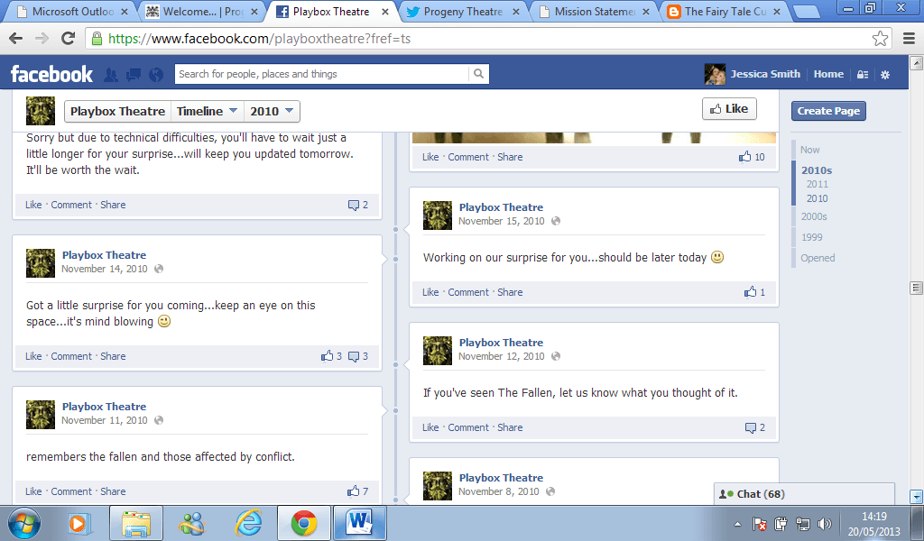
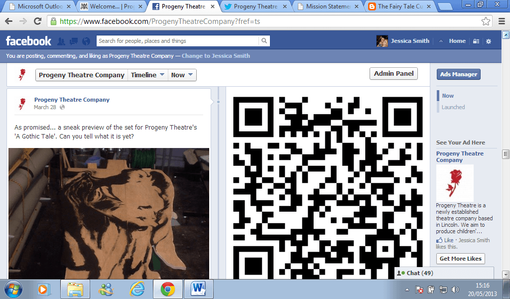
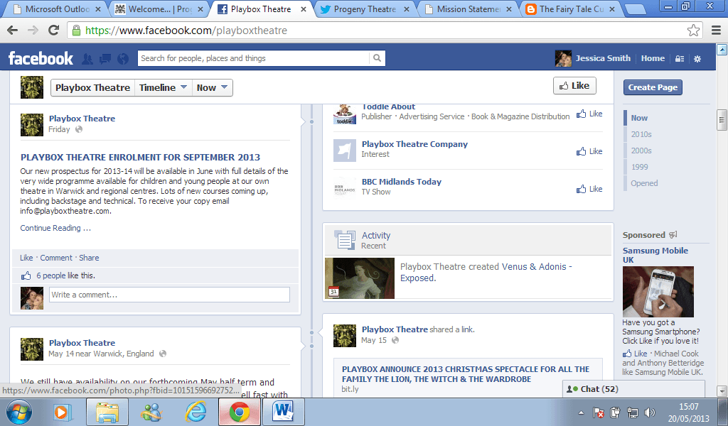
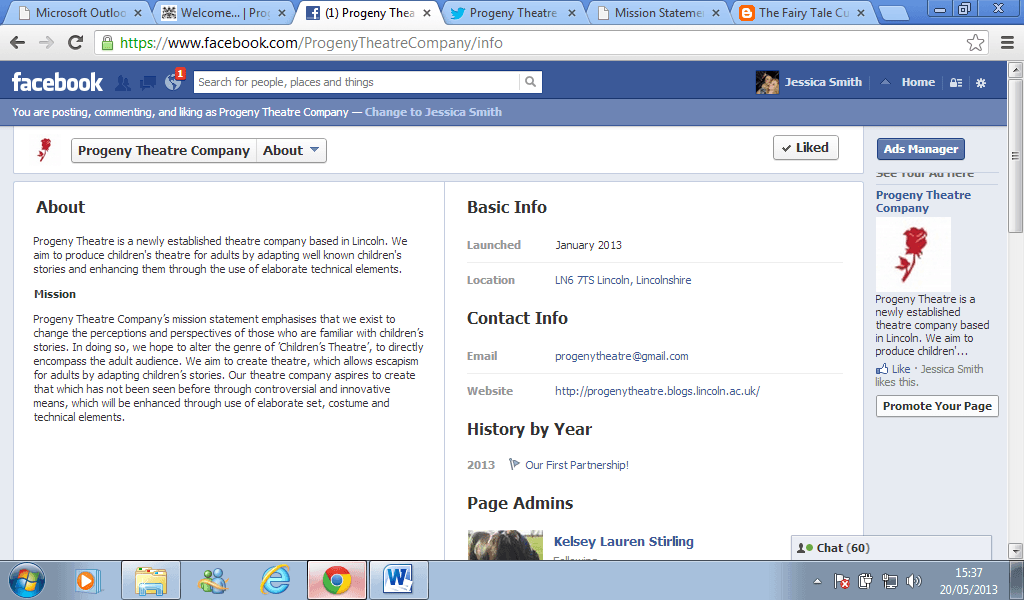
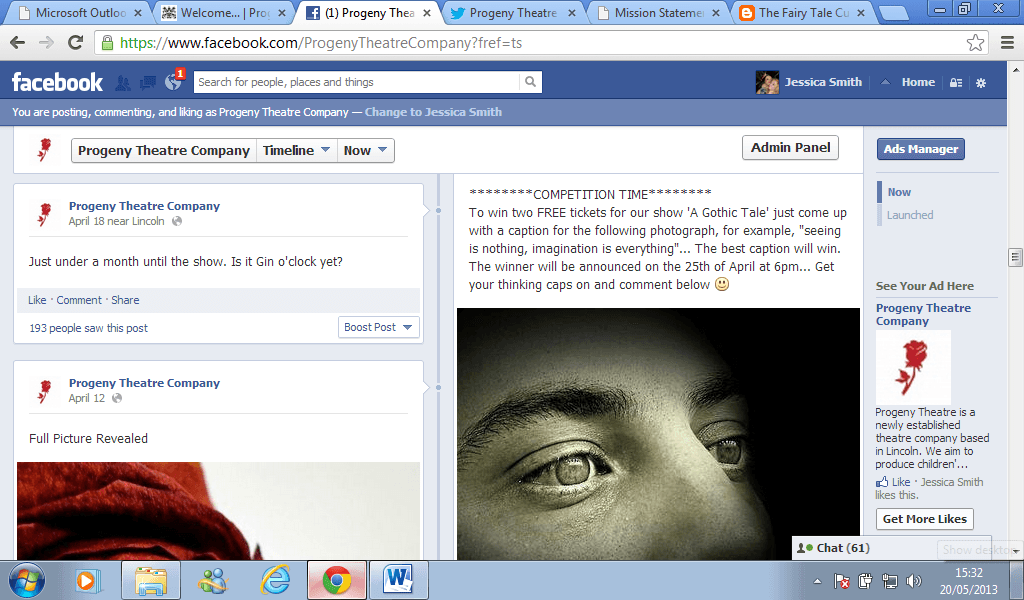
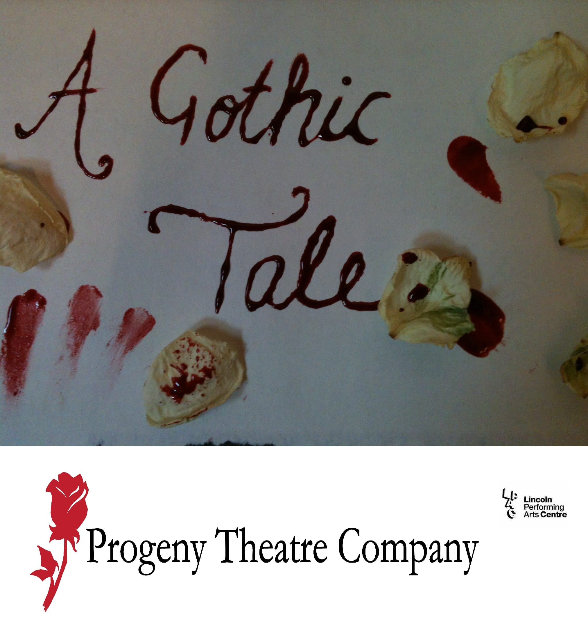
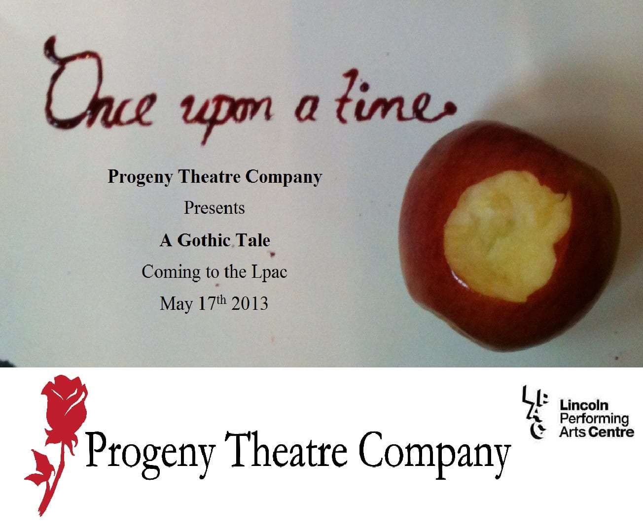
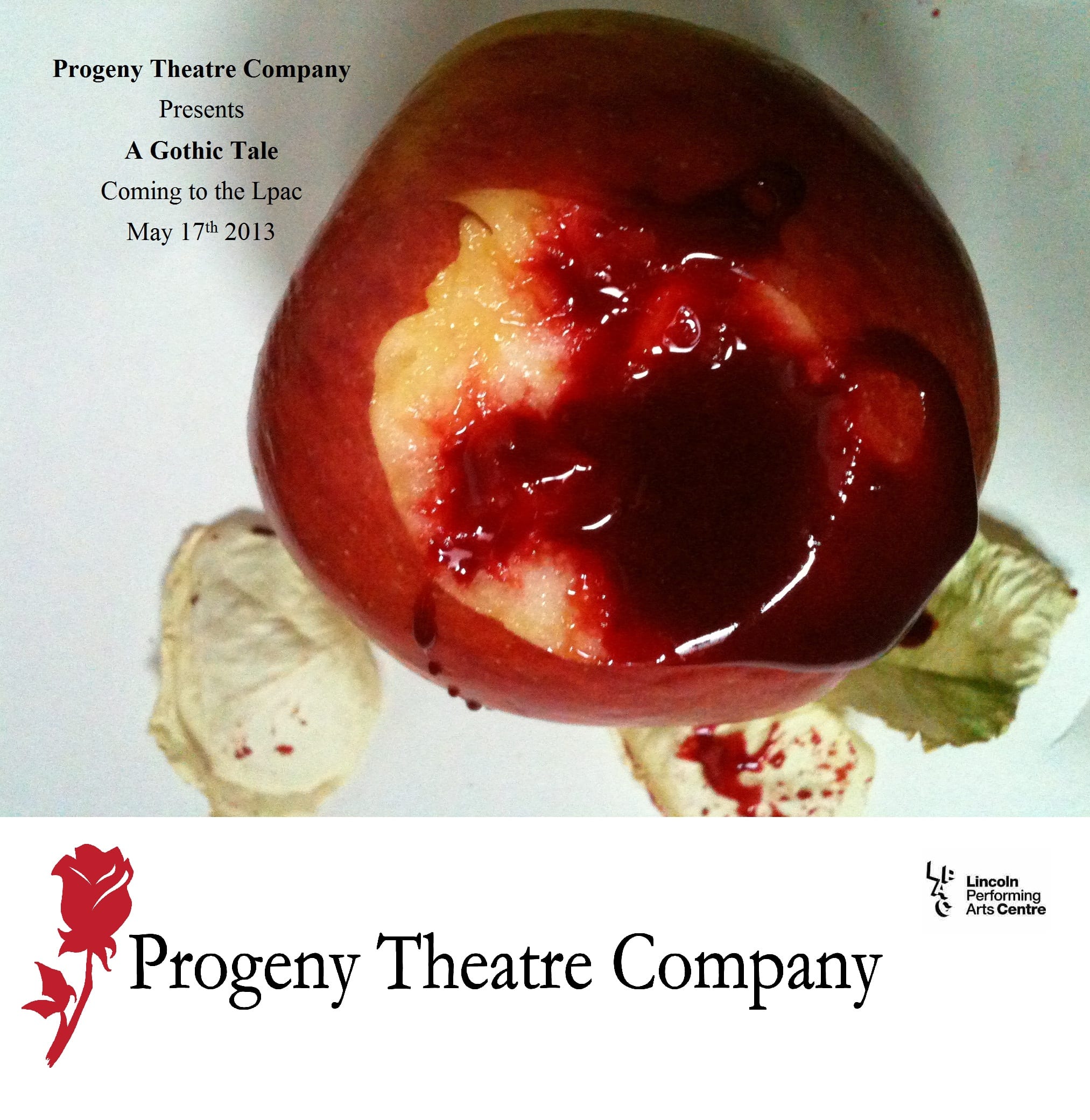
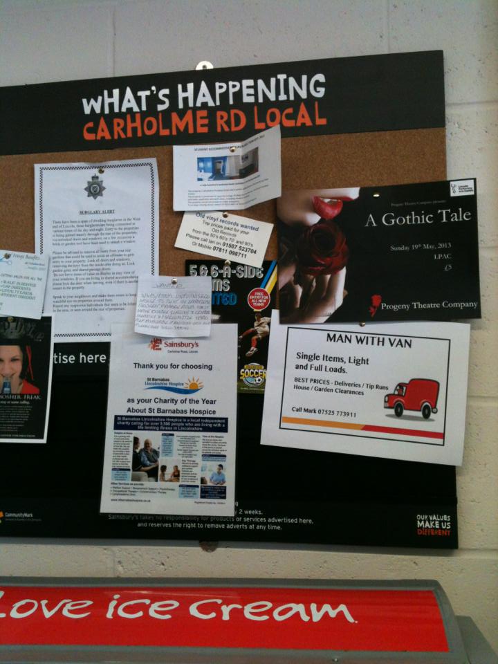
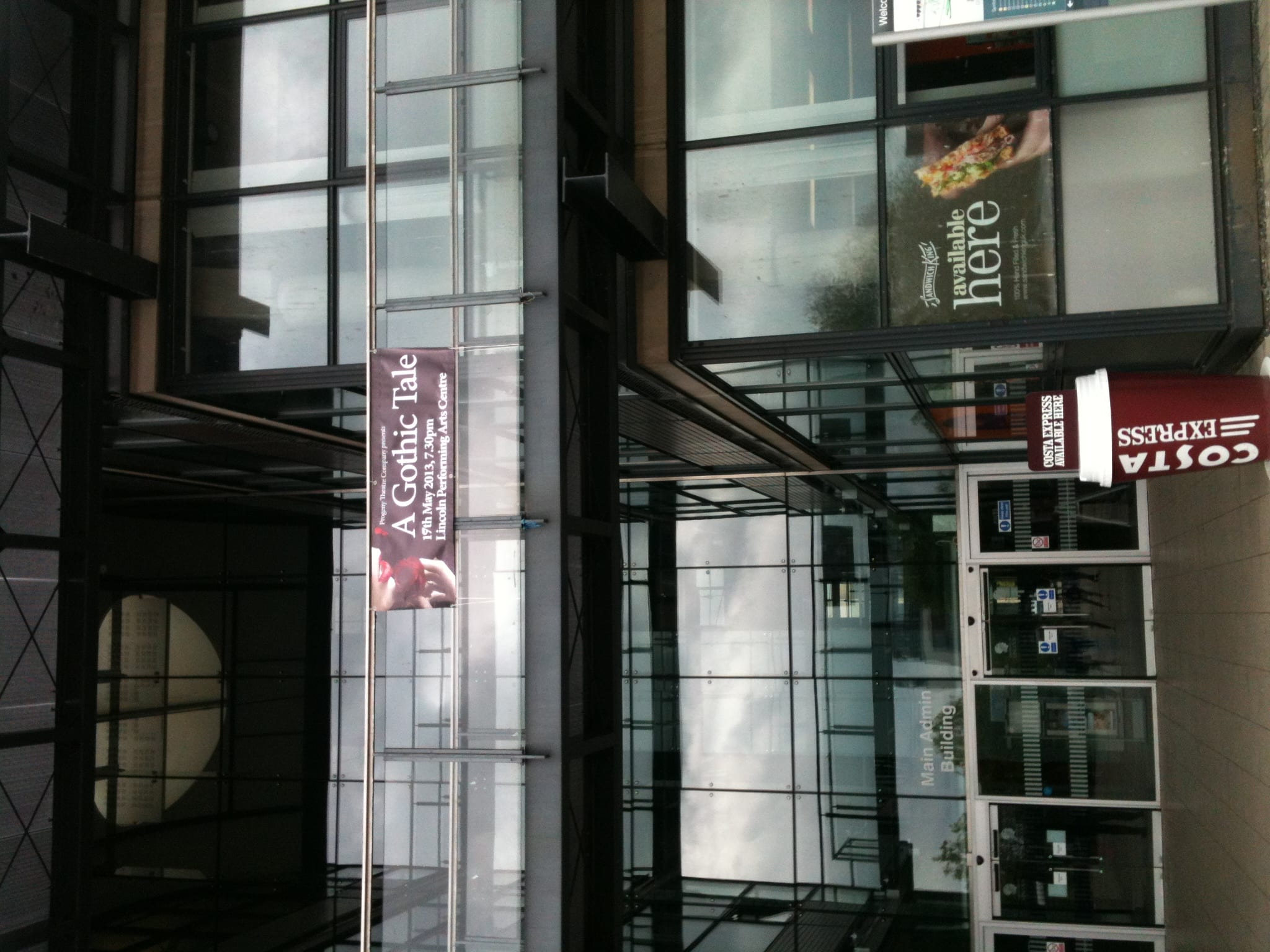
Unfortunately not all of our marketing ideas and plans were carried out. If we were a professional theatre company then I think that they would have been. However, we are not and we all have jobs, other modules, essays and other things which we have to dedicate our time to. If this was a full time job then we would have had enough time to complete each stage of our plan. Although we did manage to carry out most of our marketing plan, I feel that we simply gave ourselves too many activities to be able to put them all into action. Our social network sites were up and running by January and we communicated with our audience throughout the whole process. We did this in a number of different ways, including providing ‘teaser’ pictures, generating polls for them to complete, holding competitions and revealing general information about the company, the show and the process of creating it. We also created two promotional videos by the date that we set ourselves which were released on our social media sites. We accomplished our idea of ‘tagging’ in the University library which generated a reaction from our audience. Before doing this I made sure that I emailed the library to get permission as a precautionary measure as we did not want to receive a bad reputation as a new theatre company. We also created the posters in March; however, they were not released on time as there was a delay in the printing of them. The Company that we used made a mistake so needed to reprint them. Although this meant that we had to wait longer it also meant that we were able to change the date to the new date of the 19th of May, which occurred due to a misunderstanding. We also released different posters to our initial creations. Although the first posters that we designed displayed exactly what we wanted, they did not look very professional due to the lack of equipment that we had. Instead we decided to use a royalty free image of a woman holding a rose as this image looked more professional, due to the quality, and so had a better effect on our company image. One thing that we did not have time to do was the street performances. This was due to the fact that we were focusing on other aspects such as the posters and the tagging and then once all of these were completed we had run out of time. Due to lack of time, and people’s individual schedules, it was hard to find time where we were all available to implement street performances. If I were to do this module again I would have started with the street performances as everybody in our company seemed to have more free time at the beginning, and this was the only aspect that we needed everyone to participate in. However, overall I feel that we did carry out a sufficient amount of marketing which can be seen in the high ticket sales. We discovered that the average number of audience members to attend a student performance is fifty, yet we had over 100 audience members.


Word count: 531


Marketing plan written by Jessica Smith and Kelsey Stirling:

Progeny Theatre Company’s marketing plan


Creating the Program

When making a theatre program, for any performance, we believe that the design of the program should relate to the performance. Jessica Smith and I (the Marketing team) wanted to ensure that our program did this. This was through the appearance of the program – we used a simple yet interesting border which we believed seemed fitting to a fairy tale. It was essential for us that the program looked as if it would fit in with the fairy tale world rather than the corrupted fairy tale world that we were presenting on stage.

We wanted our programs to seem unique to our production – other than the information it contained. This could have been further achieved by the program containing a memento from the performance. The idea the marketing team and the Director had was to include a wax sealed latter from the count inviting the audience into his castle. However, budget restrictions we were unable to carry this idea through. If we were to repeat this process we would ensure to raise money for marketing so unique ideas, such as the aforementioned one, could be used.

The program contained, as any program would, the cast and crew, a director’s foreword, a show copy, acknowledgements and – of course- the details for the show. However the way our program differed from others was that we included a caption that was created by our competition winner. This was displayed on the front of our program underneath the picture. This was used to reward the winner, along with the free tickets; it would also encourage future participants to enter further competitions. The reason we chose to use this caption on our program also shows that Progeny Theatre Company have had an interactive relationship with the audience throughout the process and have continued to build this interaction within most areas of marketing. The program was as follows;

Program v3

Word Count – 307

Playbox Theatre

I have recently discovered a company named Playbox Theatre who, in 2010, produced and adaptation of Angela Carter’s The Bloody Chamber.  Matthew Finch states that Playbox were “blurring the transition from everyday life to a darker fairytale world” (2010). Although this is similar to what we were doing with A Gothic Tale, as we were showing the reality of what happened after the ‘happily ever after’ – in between the dream scenes, our performances differed drastically. Where their production was based on Bluebeard, ours incorporated Bluebeard and The Snow Child. We also added certain characters such as the Ex-Wife and the House Keeper. Finch later goes on to say, “in the opening dance, a suited man – the malevolent husband of the protagonist – moved among the girls, posing them, dancing with them, tearing out their hearts in his search for the perfect woman” (2010). Their ending was completely different too. A Gothic Tale ended with a series of twists including Elizabeth (The Countess) accidentally killing William (The Blind Piano Tuner), then with the reveal of the newly dead Ex-Wife , then Elizabeth killing the Count (on her second attempt) and finally with the House Keeper locking her in the bloody chamber. Playbox’s production ended with the Countess blinding herself with the key to the bloody chamber:

The original’s happily-ever-after conclusion is replaced by an extended sequence derived from Carter’s vampiric Lady of the House of Love. The widowed bride blinds herself with the key to her husband’s chamber and attacks the women’s magazines that litter the stage with their incessant bombardment of words and images. She feasts on stolen hearts…before turning on her new lover to quote her husband’s ominous words: ‘This is the key that leads to the kingdom of the unimaginable.’

(Finch, 2010).

Despite these differences, some elements where the same as they are based on the same story. For instance, the necklace given to the Countess, in both productions, where made of red ribbon to symbolise a slit on her neck.


Playbox were founded in 1986 and they work closely with young people,

It exists to provide young people and developing artists a unique environment for training, creation and exploration in theatre and related artistic forms.

Playbox believes passionately in the evolution of a strong artistic network regardless of age, experience, social, religious and cultural backgrounds.

Throughout the year Playbox Theatre offers a wide range of programmes and activities for young people to learn and develop skills across the arts.

(Playbox Theatre 2012).

Being a highly established company their marketing differs to ours. However, like Progeny Theatre Company, they do have a Twitter account and a Facebook page. Their Twitter account is used in the same way as ours. They use it to keep their followers informed about upcoming performances and to make announcements about their company in general. They also notify their followers about involvement opportunities within their company. With them being a well-known professional company, they do have more followers than we do. They have 944 where as we have 167.

playbox twitter 1

(Playbox Theatre’s Twitter account)


Playbox twitter 2

(Playbox Theatre’s Twitter account)


progeny twitter 1

(Progeny Theatre Company’s Twitter account)

progeny twitter 2

(Progeny Theatre Company’s Twitter account)


Playbox use Facebook to document the process of their productions and to give their audience sneak previews, as do we. We use our Facebook page in many of the same ways in which Playbox Theatre do. We have rehearsal photos, promotional videos and events, including the event of our show. We each have and ‘about’ section which include our mission statements. However, Playbox Theatre also have a small history of their company and directions to their headquarters, The Dream Factory. These are things that are impossible for us to have as we are not an established company. Although I do feel that we create more engagement with our audience due to the things such as competitions that we hold. This allows us to interact more with our audience. Again they obviously have more likes than us. They have 1,179 likes where as we currently have 233 likes.


playbox fb

(Playbox Theatre)


progeny fb

(Progeny Theatre Company)


playbox fb 1

(Playbox Theatre’s Facebook page)


playbox fb 2

(Playbox Theatre’s Facebook page)


Progeny fb1

(Progeny Theatre Company’s Facebook page)


progeny fb 1

(Progeny Theatre Company’s Facebook page)


Word Count: 689

Works Cited

Finch, Matthew (2010) Guest Post: Matthew Finch on Playbox Theatre’s ‘The Bloody Chamber’. Online:

http://thefairytalecupboard.blogspot.co.uk/2010/05/guest-post-matthew-finch-on-playbox.html [accessed 16th May 2013].


Playbox Theatre (2012) Mission Statement. Online:

http://www.playboxtheatre.com/aboutus/Mission_Statement.html [accessed 16th May 2013].

Posters

After revising the first set of posters that we created, we decided to create new ones as we were not fully satisfied with them- due to things such as the poor lighting – shown below:

progeny poster 1.2

progeny poster 2.1

progeny poster 3.2

progeny poster 4.3

This time we decided to use a royalty free image as we found one which fit our piece perfectly. The image was of a woman holding a rose (one of our motifs). The only part of the woman which was visible is her hand and her lips, on a black background. We like the simplicity of this photo as it is eye catching without giving much about our performance away. So we extended the black background to the right of the image so that we could include the necessary information. We wanted to make our poster noticeable so that it was clearly visible even amongst other posters. The darkness of our poster makes it stand out from others.

Final-Poster-Time-Inc.-page-001

Once our posters had been printed and delivered, after getting them stamped by the university, we began putting them around the university campus. Firstly we put them around Lincoln Performing Arts Centre (LPAC) and then we put them in the university library so that all students would see them. We then put them in the Media building, the students union, the main building, the Shed (public house) as well as in other areas around the campus. However, as our target audience do not only consist of students, we also went into certain shops and asked them to put them up so that the general public could see them. Many of the shops were extremely helpful in offering to advertise us and some took great interest in our posters and asked us about or show. Our posters have definitely generated the attention that we intended.

sainsburys poster


As well as posters, we also had a 6ft by 2ft banner printed. This consisted of the same image and information as the posters as we wanted to keep our advertising consistent. Through the Brand Manual (created by Sam Taylor) we learnt that consistency is significant when advertising. This is due to the fact that a company need to make their advertising instantly recognisable. For instance, after seeing the design and layout of our posters, the banner becomes immediately associated with them, and our company, just by having the same images, colours and font type. Unfortunately our banner had the wrong date on it as it had the 17th of May instead of the 19th of May, due to an unavoidable mix up. With such a small amount of time and a small budget we could not get this reprinted. The only solution that we could think of was to change the date ourselves. We did this using a white marker pen as it was the only thing that would stand strain against weather conditions. After sending emails and making telephone calls, I managed to get permission to hang the banner outside the main building of the University. I feel that this made a substantial difference to the sale of our tickets. Before putting the banner up we had only sold thirty eight tickets, however, by the day of our show we had sold over 100 tickets.

banner 1

banner 2


Word Count: 531


Progeny Theatre Company’s Brand Manual by Sam Taylor:

Brand Manual

Taylor, Sam (2013) Brand Manual, Lincoln: Taylor and Watt Designs

Show Copy


Progeny Theatre Company presents their debut performance A Gothic Tale, an adaptation of Angela Carter’s The Bloody Chamber. Expect a visually stunning piece of theatre, which creates an impression of standing on the threshold between two worlds.
It is a corrupted fairy tale, challenging the traditions and expectations we have come to expect from “Once Upon A Time”, and tells the story of what comes after the “Happily Ever After”. When the fairy tale world slowly becomes corrupted and cracks begin to show, we are forced to question if any innocence can remain.
This performance is intended for adult audiences only (16+). It contains violence and scenes of a sexual nature.


Word Count: 109

1 2